Digital signages are used to share different types of information. Of course, the purpose is to show information to as many people as possible. Splitting the screens in different zones helps maximize the available communication space and can attract the attention of more visitors, passers-by or employees.
Optimizing space
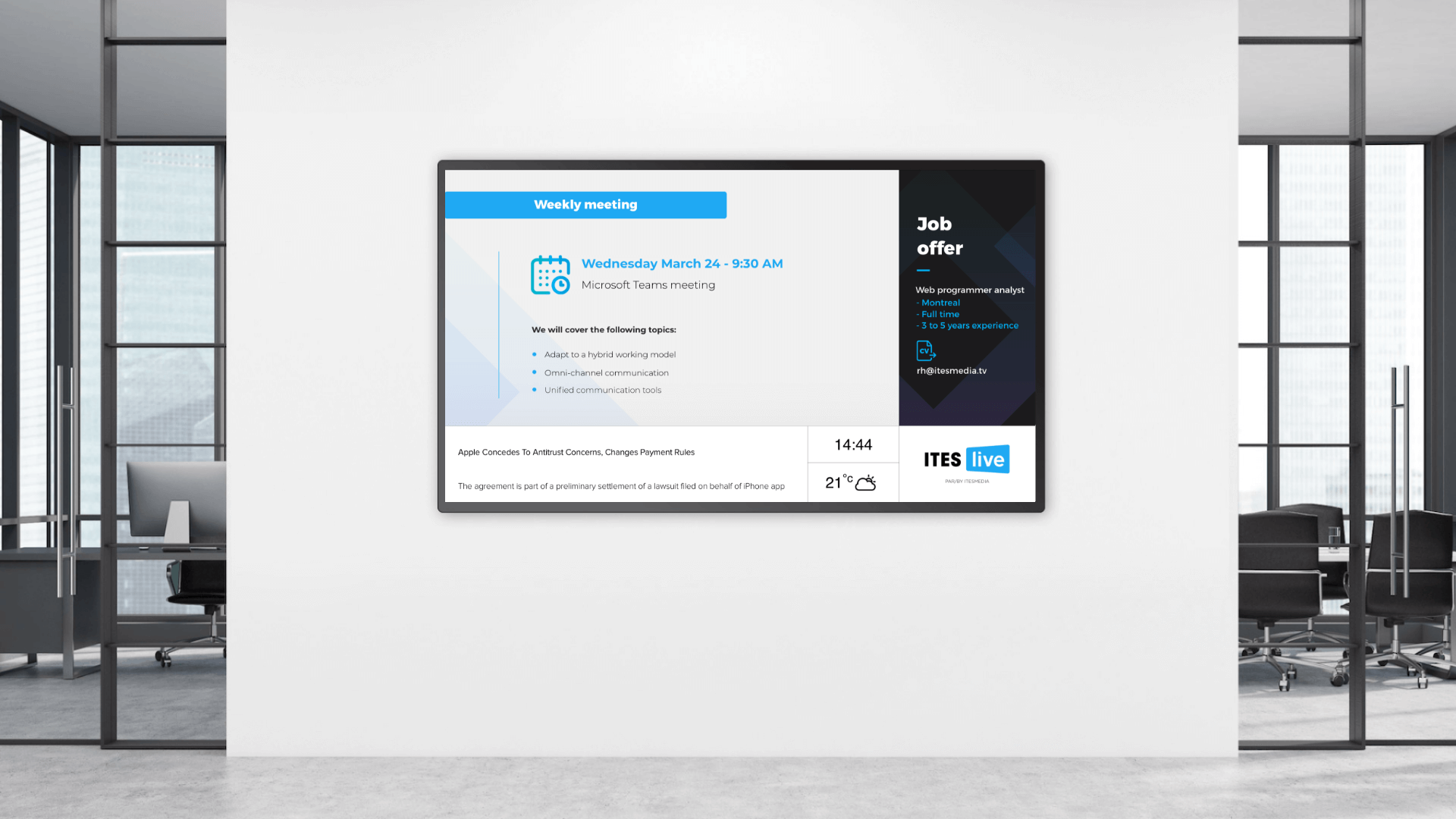
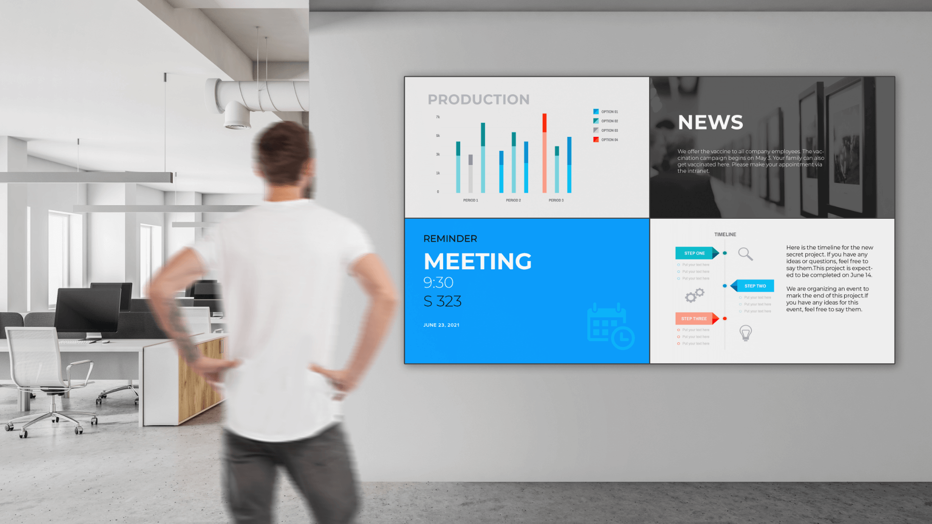
Dividing your displays in different zones is an excellent way to maximize space and show different content simultaneously. Displays are usually split in a larger primary zone, a smaller one on the side, and other small sections at the bottom.

The primary zone is usually used to display more important content simply because it’s the largest one. The secondary zones can be used to display eye-catching content such as the weather, news, an employee’s birthday, the consecutive number of days without a workplace accident, mass transit schedules, and much more. The lower zones can display information that require less space such as the weather, the date, the time, the company logo or the news. It might look trivial, but this information is very eye-catching for your audience. Multi-zone display lets you mix different types of content in the various zones. For example, you could show a video in the primary zone and share real-time production data in the secondary zone on the right of the screen. In other words, the greatest benefit of multi-zone display is the ability to share different types of content at the same time instead of only showing a single information element on the entire screen.
Advice/Tips
Displays can easily be divided any way you like with digital display software (such as ITESlive). Before splitting up your screens, first read the following guidelines.
Your primary zone’s aspect ratio
In general, we recommend using a 16:9 ratio for your primary zone. This 16:9 ratio is the same used by most digital displays as well as by television screens (for example, 1920 x 1080 p (HD) and 3840 x 2160p (UHD 4K) resolutions have a 16:9 ratio). As such, your audience is used to watch content in this format, and digital display network managers can usually reuse your available content.

Read: Top 10 best practices in content creation for internal communications
Safety margins
Your content needs room to breathe, which means you need to maintain safety margins between the zones. These margins enable the segmentation of different types of information and makes reading easier. Most of the time, there should be a safety margin of 50 pixels around each zone, as shown below.

Dividing your displays in different zones lets you make the most of the available space by letting you share different types of information at the same time, and a good information layout ensures your audience will have an enhanced experience.


